
{{{Quick Question: Does anyone know how to find out what Aperture/Shutter Speed/ISO I used on each shot in either iPhoto or Flickr? I want to include that information with the pictures, but when I'm taking 50 of the same thing, I can't remember which is which! Once I get that, I'll edit to add the correct info for each picture.}}}
OLD I took a whole bunch of ugly photos of this beautiful teapot my hubby's grandmother gave me when we were getting married. The teapot belonged to her mother--or his grandpa's mother...I need to double check on that! I love the gold lines painted on the handle and spout of the of the pot. This sits on my "window sill" in the kitchen over my sink. It's actually a little cubby in our cabinets where I keep my favorite cookbooks and a few other treasures.
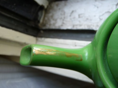
It was really hard for me to work on balancing the light in these shots. It wasn't because the lighting was off or my camera wasn't cooperating; it's just a totally new concept to me. I've worked in Aperture mode before, but never fully in Manual. Also once I changed the perspective of my shot to focus on the details I was able to get something I actually liked.
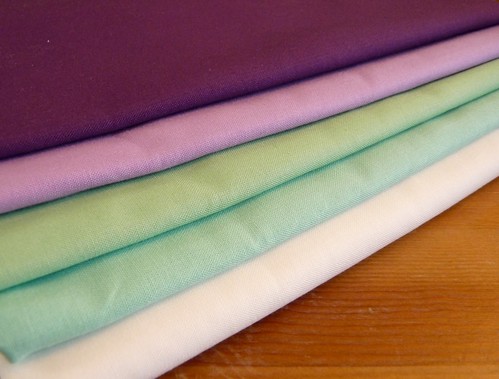
NEW What's better than new fabric?! I ordered some Kona Solids last week from the Fat Quarter Shop to go with some of the Parisville FQs I already had. These will all be made into a quilt for my older sister.
In the first shot, I just focused on the new fabrics and getting the light to balance. I am loving these colors!
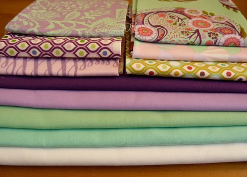
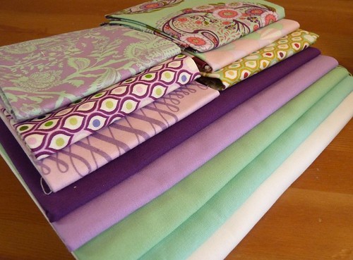
In the next shots I added the element of perspective and the rest of the fabrics. Notice how the second one looks so much better just from being taken at a diagonal rather than straight on.
I have a Kona solids card I won a long time ago from Purl Soho (thanks again!), and at the time I thought it was pretty lame. I didn't use solid fabrics and didn't plan to. Fast forward to today and I am slowly growing in my appreciation for solids and thus for the card. It's so much better than looking at my computer screen trying to decide which of the 25 shades of green to use with my fabrics! I'll admit that I'm less likely to branch out to other brands because of this (good job RK, you got me!) but I'm OK with that.
I'm linking up with the rest of the "students" at Beth V's blog today! Check out their old and new perspectives, too!


In Flickr, you know where it says the date of when the picture was taken and what camera you used? Well, click on the link to the camera you used and all the info pops up. Hope that helps :)
ReplyDeleteYour photos are great, you got the angles perfectly! I love the fabric! Yum! I have that Parisvile bundle too... I couldn't resist it!
ReplyDeleteKelly - In iPhoto you can find all of the information (shutter speed, etc.) on the bottom right choose the "Info" button and then everything is listed on the top of the screen. Hope this helps! Mitzi
ReplyDeleteA lot of people had this question after the first email-if you check the blog post for today, I answered your question! :) The photos look great-love getting new fabric. I have a terrible addiction.
ReplyDeleteThe quilt is going to be gorgeous! Now I know why I didn't know about the quilt, because I got way behind on reading your posts. I'm sorry.
ReplyDelete